

Getting readers of a news story interested in numbers can be a challenge. But the benefits of engaging readers in data can lead to a better understanding, preventing misinformation and misrepresentation in the news.
New research by Haiyan Jia, assistant professor in the Department of Journalism and Communication and the Data X Initiative at Lehigh University, and S. Shyam Sundar, the James P. Jimirro Professor of Media Effects at Penn State University, explored different ways journalists present data and recommend a method using an interactive visualization.
Inspired by exemplification theory, Jia wanted to see the persuasive effect data could have and whether or not the process could be interactive for readers.
In exemplification theory, exemplars like small stories or anecdotes that are more compelling and interesting are compared to statistical information in news stories, and people will tend to form their impression of the issue based on those exemplars.
Sundar, an expert in exemplification theory, adds that when readers see data through these exemplars, it’s often not comprehensive and it doesn’t paint an accurate picture.
Compared to abstract numbers, the more influential way to tell a story is through examples, but they are not always an accurate reflection of broad situations such as public opinion, he explains. And getting readers interested in the numbers is important to achieve accuracy and prevent biased interpretation.
In this research, Jia and Sundar asked “how can we make numbers more vivid and engaging, just like a story with examples?”
The solution? No longer presenting data only through textual descriptions or tables, but as an interactive visual.
The study, Vivid and Engaging: Effects of Interactive Data Visualization on Perceptions and Attitudes about Social Issues, is published in Digital Journalism and was supported by a U.S. National Science Foundation (NSF) grant.
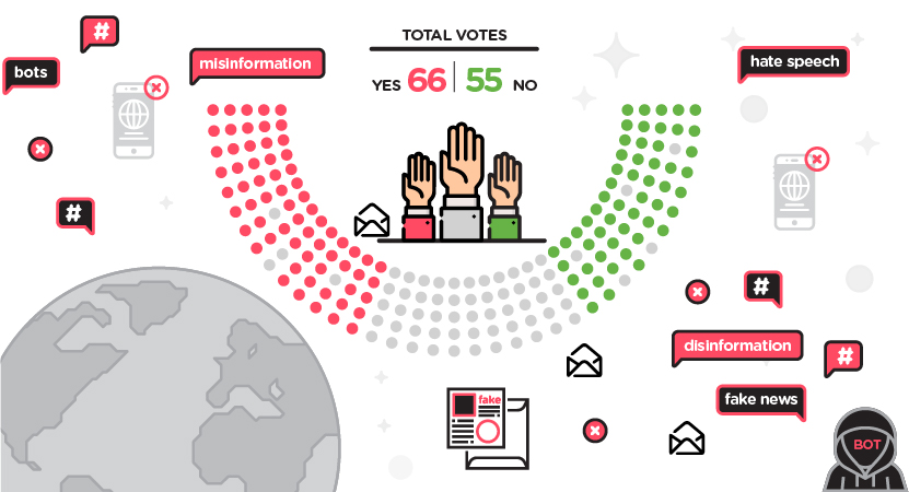
The results show that through interactive data visualization, readers are able to process numerical information in a systematic way by making that information more vivid.
“Data usually has the potential to show a more representative understanding of a certain issue because it covers more people. It shows more depth,” says Jia.
But making the data effective is a challenge newsrooms face, the researchers say.
Acknowledging the complexity of data, which can make it difficult to process, the researchers looked at three methods of data display: plain text, a static visualization, and interactive visualization.
The study showed participants had a difficult time recalling and recognizing the data through text and static visualization. Interactive data visualization led to the most positive outcome variables in terms of information recognition and recall.
The numbers presented became more palatable and engaging for readers when they were able to focus and interact with them.
Having a full understanding of the data through interactive visualization can lead to attitudinal change for readers, the researchers say. And the benefits of this visualization can have a direct impact on misinformation and transparency, making it an important consideration in journalism.
“Interactive data visualization brings readers that much closer to the data and also that much closer to the truth,” says Sundar.
It is the journalist’s role and responsibility to make data accessible, comprehensible and attractive, says Jia. The researchers hope to see continual investment in building effective and usable tools, as well as increased hiring and training among multimedia staff in newsrooms.

Leave a Reply